Welcome — whether you’re preparing a business pitch, a classroom lesson, or a personal project, the right type of presentation makes all the difference. Knowing the common types of presentation helps you choose the fastest, most effective way to organize information and engage your audience.
This guide shows practical, time-saving approaches to build great presentations and high-impact presentation slides without getting bogged down in design. You’ll learn which types of slides and layouts work best for different goals (inform, persuade, train, or inspire), plus simple tips and a few tools to regain confidence and finish decks faster.
Read on to discover a proven way to turn your key points into polished slides, pick the right template or tool, and deliver presentations that win attention — even when you’re short on time.
Presentations are one of the most common ways we share information across business meetings, classroom lessons, and personal projects. Well-crafted presentation slides turn ideas into clear messages that support better communication, whether you’re reporting data to a team, teaching a concept to students, or pitching a project to stakeholders.
That said, creating effective presentations can feel time-consuming — especially when you need professional-looking slides quickly. The problem: presentations require clear structure, concise content, and visual polish. The promise: this article gives practical steps, templates, and tool recommendations to speed the process without sacrificing quality.
Effective slide design captures attention and helps your key points stick. Focus on clarity, purposeful visuals, and an organized flow so your audience follows your story. Later sections walk through the main steps — from choosing the right presentation type to picking a template and finishing with a concise call-to-action — so you can create crisp, usable slides fast.
Understanding Different Types of Presentations
To communicate clearly, you need to know the different types of presentations and when to use each. The right type presentation aligns your content, visuals, and delivery with your goal and your audience’s expectations. Below are four primary types, with a concise example for each and a note on hybrids.
1)Informative Presentations: Share facts and data.
Informative presentations deliver clear, concise information and data to educate the audience. Typical examples include research briefs, status updates, or product demos that focus on data, timelines, and outcomes. Use charts, tables, and labeled visuals to make complex information easy to scan and remember.
2)Persuasive Presentations: Convince the audience to take action.
Persuasive presentations aim to change opinions or drive decisions—think sales pitch, investor ask, or policy recommendation. They combine logical arguments, benefits-focused content, and storytelling to create impact. Lead with a clear problem, show supporting data, then close with a direct call-to-action that explains the next steps.
3)Instructional/Training Presentations: Teach skills or concepts.
Training presentations teach new skills or concepts and are common in onboarding, workshops, and classroom settings. Break the content into short, digestible steps, include examples and practice activities, and reinforce with visuals that guide learners through the process. Good training decks use checklists and simple diagrams to support learning transfer.
4)Inspirational Presentations: Motivate and engage the audience.
Inspirational presentations use storytelling, personal anecdotes, and emotional framing to motivate an audience—typical formats are keynote speeches and motivational talks. These decks emphasize memorable visuals and a narrative arc that builds to a clear, motivating idea rather than dense data.
Note on hybrids: many presentations blend types—for example, a persuasive sales pitch often includes informative slides with data, and training sessions may use inspirational stories to boost engagement. Choose the dominant presentation type based on your primary goal, then borrow elements from other types as needed. Later sections link to templates and tools that match each presentation type for faster deck creation.

Choosing the Right Presentation Type for Your Audience
Selecting the best presentation type starts with knowing who will be in the room. Audience type, purpose, and setting directly affect slide design: a small internal team meeting, a client-facing sales pitch, and a classroom lecture each demand different pacing, visuals, and levels of detail. Match your content and visuals to the audience’s knowledge, interests, and expected benefits to maximize engagement.
Use these three quick decision questions to choose the right type presentation and align your slides with your goal:
- Who is the audience? (senior executives, technical team, students, clients) — adjust language and depth accordingly.
- What is the goal? (inform, persuade, train, inspire) — pick the dominant presentation type and structure your content around that goal.
- Where and how will it be delivered? (in-person, remote, short pitch, workshop) — simplify slides for small screens and favor bold visuals for remote delivery.
Examples by setting: for an internal status update, use an informative approach with clear data slides and concise points; for a client pitch, adopt a persuasive structure with benefit-driven slides and a clear call-to-action; for a classroom or training session, use instructional slides with step-by-step visuals and short practice activities.

Practical tip: run a one-question poll or quick pre-meeting survey to learn the audience’s familiarity with the topic and what they hope to take away — a 60‑second check that guides content depth and saves you time. Aligning slides to the audience’s needs and the presentation’s goal keeps your deck focused and increases its impact.
Essential Elements of the Best Slides
Great presentations rely on a few non-negotiable elements. Prioritize clarity so your audience can absorb information quickly, and use visuals and layout to amplify—not bury—your message. Each slide should be simple, focused on one idea, and designed to support the speaker rather than replace them.
1)Clarity and Simplicity: Avoid clutter, focus on key points.
Keep slides scannable: aim for a single headline and no more than 3–5 bullets or one main visual per slide. State the core idea in the title, then use short key points (6–8 words max per bullet) to support it. This reduces cognitive load and keeps attention on what matters.
2)Visual Appeal: Use images, icons, charts, and consistent colors.
Choose visuals that clarify information: icons for concepts, photos for emotion, and charts for numeric comparisons. Use a consistent color palette (3–4 colors) and repeat visual elements so the deck feels cohesive. When presenting data, prefer simple charts—bar charts for comparisons, line charts for trends, and pie charts only for very simple share breakdowns—to make interpretation immediate.
3)Typography: Readable fonts and proper sizing.
Select clean, legible fonts and maintain hierarchy: large titles (recommended 28–36pt for screen), body text no smaller than 18–20pt for typical screen sharing or projector setups. Use bold and color sparingly to emphasize one idea per slide. Also check color contrast for accessibility so text remains readable for all viewers.
4)Call-to-Action: End with a clear message if persuasive or instructional.
Close persuasive or instructional decks with a concise CTA: a single sentence that tells the audience the next step (e.g., “Approve budget,” “Sign up for the workshop,” “Implement these three changes”). If appropriate, include a single slide labeled “Next steps” with 2–4 actionable items so stakeholders leave knowing exactly what to do.
Quick template suggestion: Title + 3 bullets + 1 visual + footer CTA. This layout balances visuals and information, keeps each slide purposeful, and speeds up design when you repeat the structure across the deck.
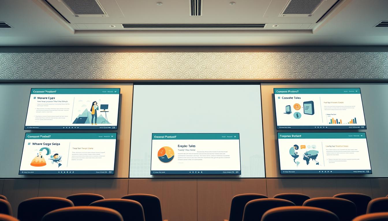
Tools and Presentation Makers to Speed Up Slide Creation
Designing polished slides gets much easier with the right presentation maker. Popular options—Microsoft PowerPoint and Google Slides—cover core needs with reliable templates, master slides, and collaboration features. If you want more design-forward options, Canva and Prezi provide creative templates and motion-focused layouts that can save hours of work.
Speed-saving features to look for in any tool:
- Templates and theme kits: ready-made layouts for different presentation types (sales pitch, training, status update).
- Auto-layouts and grids: automatic alignment and spacing so you don’t adjust every element by hand.
- Slide libraries and brand kits: reuse approved slides, logos and colors across projects to keep decks consistent.
- AI suggestions: automated text-to-slide or design recommendations (available in some tools) to jumpstart a deck.
Which tool fits your goal? Quick business pitches: PowerPoint or Google Slides (fast, familiar, collaboration-friendly). Design-heavy keynotes or marketing decks: Canva or Keynote (strong visuals and templates). Interactive or nonlinear storytelling: Prezi. For training or classroom projects where reuse is key, pick a tool with a robust slide library and easy template updates.
Time-saving workflow: start with a template that matches your presentation type, populate content at the outline level, swap in visuals from a shared library, then apply your brand kit and run a quick accessibility check. This process minimizes rework and makes future updates faster.

Step-by-Step Tips to Create Slides Quickly
Creating slides quickly doesn’t have to be overwhelming. Use a content-first process (outline → visuals → polish) and a reliable template to cut design time while keeping quality high. Below are practical, timed steps you can follow for most presentations.
1)Start with a template matching your presentation type.
Time: 5–10 minutes. Pick a template that fits your presentation type (informative, persuasive, instructional, or inspirational). Templates speed up layout and keep presentations consistent. For example: sales pitch templates prioritize benefits and CTAs; training templates include steps and practice slides; informative templates focus on data and charts.
2)Organize content into clear sections.
Time: 15–25 minutes. Create a simple outline: title slide, 3–5 main sections, and a closing slide with next steps. Break each section into one idea per slide. This lets you organize content efficiently and makes it faster to populate visuals and speaker notes.
3)Use visual aids instead of long paragraphs.
Time: 20–40 minutes. Replace dense text with visuals—icons, images, and charts—to communicate faster and keep audience attention. Use charts for numeric comparisons (bar/line), icons for concepts, and photos for emotional impact. A single clear visual often conveys what a paragraph cannot and helps you create slides quickly without information overload.
4)Keep animations and transitions minimal to save time.
Time: 5–10 minutes. Stick to subtle builds (appear/fade) when needed and avoid complex transitions that require tweaking. Minimal animation reduces setup time and prevents distracting your audience from the main points.
Quick checklist (30–90 minute mini workflow):
- Outline content (15–25 min): define sections and slide titles.
- Apply template & layout (5–10 min): drop in headings and core bullets.
- Add visuals & charts (20–30 min): swap text for icons/images/charts.
- Polish & CTA (5–10 min): check typography, contrast, and a clear next step.
Examples: for a 10-slide sales pitch, use: 1 title, 1 problem, 3 solution/benefit slides, 2 proof/data slides (with charts), 1 pricing/options slide, and 1 CTA/next steps slide. For a training module, include step-by-step slides, a short exercise, and a recap slide with resources.
Micro-CTA: if you’re short on time, pick a matching template from your preferred presentation tool and follow the checklist above—reusing a branded slide library will save time on future updates.
| Tip | Description |
|---|---|
| Template Selection | Use a relevant template to save time and maintain consistency. |
| Content Organization | Break your content into clear sections to enhance understanding. |
| Visual Aids | Replace long text with engaging visuals for better communication. |
| Minimal Animations | Use simple animations to focus attention and conserve time. |
Advanced Tips for Professional-Looking Slides
To lift your presentations from good to great, apply a few advanced techniques that improve clarity, cohesion, and visual impact. These practices are especially valuable for business decks, sales pitches, and any presentation where you want to leave a lasting impression.
1)Use charts and infographics to simplify complex information.
Turn dense numbers into clear visuals: choose a bar chart for comparisons, a line chart for trends, and simple stacked bars or small multiples for segmented data. Use infographics to combine short text, icons, and a single data point so viewers grasp the main idea in seconds. When designing charts, label axes clearly, highlight the key data point in a contrasting color, and include a one-line takeaway caption so the chart supports your narrative.
2)Maintain consistent branding or theme for business presentations.
Apply a brand kit (logo, two primary colors, one accent color, and two fonts) across the deck to ensure professional cohesion. Use consistent header sizes, color rules for calls-to-action, and the same photo treatment (e.g., desaturated with accent overlay) so slides look like part of a unified presentation. A short style guide or master slide set saves time on future presentations and keeps teams aligned.
3)Optimize images for clarity without slowing down the presentation.
Use high-quality images but optimize file size: aim for 100–300 KB per full-slide image when possible, export JPEGs for photos and PNG for graphics with transparency. Compress images and use 72–150 DPI for screen presentation to balance clarity and load time. Always preview slides on the device you’ll present from to confirm image sharpness and performance.
Do / Don’t quick list:
- Do: highlight one data point per chart, use consistent color for your brand, and prepare a master slide deck.
- Don’t: overload charts with too many series, mix multiple font families, or rely on very large uncompressed images that slow down the deck.
Before/after example (brief): a crowded slide with three tables becomes a clear, professional slide by replacing one table with a simple bar chart, using the slide title for the main takeaway, and adding a branded footer — the result is easier to scan and makes the key message obvious.
Final tip: assemble a reusable brand kit and slide library for your most common presentation types so you can produce polished, on-brand decks quickly and consistently.
Common Mistakes to Avoid in Slide Design
Creating effective presentations requires attention to detail. Recognizing frequent slide design mistakes helps you deliver clearer messages and keep your audience focused. Below are common pitfalls and practical fixes you can apply immediately.
1)Overloading slides with text or data.
Problem: slides crowded with long paragraphs, multiple tables, or dense charts bury the main idea and force your audience to hunt for meaning. Fix: apply the “one idea per slide” rule — move supporting data to an appendix or handout and boil the slide down to a single headline and 2–4 concise bullets or one clear visual.
Five-step cleanup for an overloaded slide:
- Identify the main takeaway and put it in the title.
- Remove any sentence that doesn’t directly support the takeaway.
- Replace long text blocks with a chart, icon, or short bullet list.
- Move detailed tables or raw data to a backup slide or handout.
- Read the slide aloud — if it takes more than 10 seconds to state, simplify it further.
2)Using inconsistent fonts or color schemes.
Problem: mixing many fonts and colors makes a deck look unprofessional and distracts from the message. Fix: limit fonts to two complementary families (one for headings, one for body) and use a palette of 3–4 colors: primary, secondary, accent, and neutral. Apply the colors consistently (e.g., accent color for CTAs) and use master slides to enforce the rules across the deck.
3)Ignoring the audience’s attention span or purpose of the presentation.
Problem: long, unfocused slides and poor pacing lose attention quickly. Fix: tailor length and depth to the audience and purpose — shorter, high-level slides for executives; more detail and step-by-step visuals for training. Break content into sections, use frequent visual variety, and end sections with a one-sentence recap to refocus attention.
Quick fixes you can do in 10 minutes:
- Scan the deck and consolidate slides that cover the same idea.
- Swap one long-text slide for a chart or single strong image plus a headline.
- Standardize fonts and check contrast on three representative slides.
Example (before / after): a “before” slide showing three full tables becomes an “after” slide with one highlighted chart, a one-line takeaway in the title, and a link to the full data in the appendix — the audience immediately sees the point without getting lost in numbers.
Final tip: always run a quick peer review or dry run. A colleague’s fresh eyes catch unclear slides and pacing issues you’ll miss; a brief rehearsal confirms timing and reduces last-minute stress.
Conclusion
Choosing the right types of presentation and applying slide best-practices are the fastest routes to clear, persuasive communication. Whether your objective is to inform, persuade, teach, or inspire, selecting the appropriate type and focusing on clarity, strong visuals, and organized content will improve your delivery and the audience’s takeaway.
To work more efficiently, use a reliable presentation maker or template library: it speeds creation, ensures consistent branding, and makes future updates to a project simple. A couple of smart tools and a small reusable slide kit can save hours while keeping quality high.
Recap: match your presentation type to your goal and audience, keep each slide purposeful, and lean on templates and tools to finish faster without sacrificing polish. Try a template in your favorite tool now and see how much time you can save on your next presentation.
