📺 Today’s recommended deep-dive video: https://www.youtube.com/watch?v=nDvpMS1jr_U
Mastering the “Cabbage Petal” Peony: A Guide to Freehand Composition and Layering
Traditional Chinese painting isn’t just about the brush; it’s about the geometry of the paper. By mastering the “cabbage” wrapping technique, you can create peonies that feel thick, round, and full of life. This article breaks down the instructor’s process for balancing density and depth on a four-foot square rice paper.
Core Question: How can a beginner use structured folding and specific layering techniques to master the complex “cabbage-style” peony composition?
Highlights
- Organizing the layout using the “Tianzi” grid on 70×70 cm rice paper.
- The “Cabbage Method” for creating dense, wrapped flower heads.
- Using the “fill-in-the-blank” technique to add depth between petals.
- Crafting explosive and reserved stamens using white thread and yellow dots.
⏱️ Reading time: approx. 8 minutes · Saves you about 70 minutes vs. watching.
Want to take notes while watching? Click the image below and let AI Notebook capture the key points for you 👇

The Geometry of Composition
Setting the Stage with the Tianzi Grid
Before a single drop of ink touches the paper, the foundation must be set. We begin with a four-foot square of rice paper, measuring 70×70 centimeters. To manage this large space, we fold the paper into a “Tianzi” grid, a simple cross-shaped guide that helps us find our center and maintain balance throughout the painting process.
Finding the location of the flower heads is the most critical step in ensuring a stable composition.
I place the main flower head in the upper left quadrant, slightly elevated to command attention. To balance this, a secondary flower head is positioned on the right, while buds are placed on a lower horizontal line to ground the piece. The branches are then “provoked” from the bottom, lifting upward and interweaving between these focal points to create a sense of natural growth.

💡 Digging Deeper
Q: Why fold the paper instead of drawing guide lines?
A: Folding creates subtle, physical ridges that guide the brush without leaving permanent ink marks that might interfere with the final aesthetic.
Q: What is the significance of the 70×70 cm size?
A: This is the standard “four-foot square” size in Chinese painting, providing enough room for expansive, freehand strokes while remaining manageable for home studios.
Q: How do you decide where the signature goes?
A: The signature usually falls in the lower-left area, filling the “white space” to balance the weight of the main flower head on the opposite side.
Building the Flower: The Cabbage Technique
Layering and Wrapping the Core
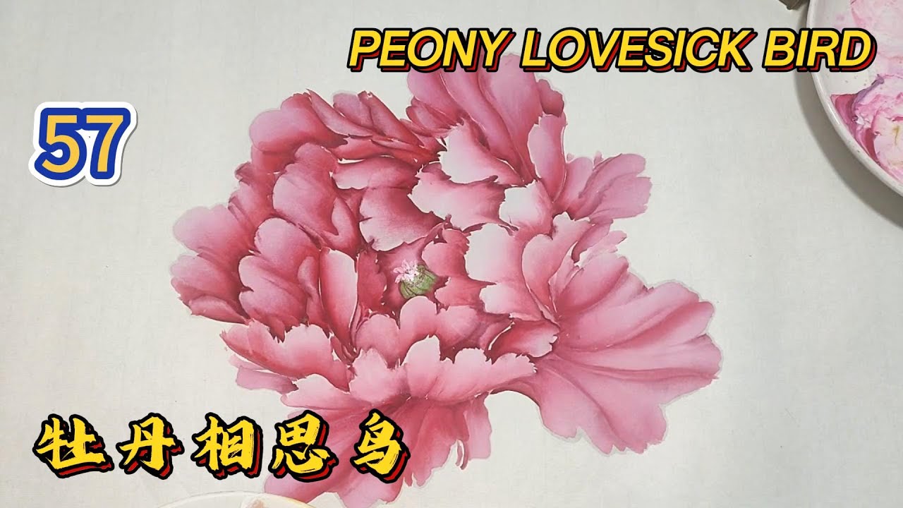
The “cabbage” style of peony is defined by its thick, rounded appearance, where petals seem to wrap tightly around a central core. We start with a base color of white mixed with four tablespoons of water until it reaches a milky consistency. We then dip the brush in rose red for the body and a hint of rouge at the tip to create a natural gradient.
You must wrap the petals inward, creating a sense of a “flower ball.”
Start by drawing the central petals, then “package” them by adding layers that tilt upward. By pressing the tip of the pen and dragging it to create varied widths, you mimic the natural roll of a petal. It is essential to keep the center thick and the bag round; don’t worry about perfection, just focus on the firmness of the “package” as it grows from the center outward.

The Fill-in-the-Blank Method
Once the primary structure is established, the “fill-in-the-blank” method is used to eliminate distracting white gaps between the petals. Using a mixture of Sichuan red and rouge, you carefully click the tip of the pen into the empty spaces. This doesn’t just cover the paper; it creates the dark recesses that give the flower its three-dimensional depth.
This technique separates the petals while keeping them visually connected.
You can modify the internal petals by adding small, light strokes that indicate the edges of the inner folds. If the color feels too flat, add a “scar” or a small roll to the petal edge to break the uniformity. This makes the flower feel slanted and alive rather than a static, perfectly symmetrical circle.
Stamens, Buds, and Seasonal Variations
Creating the Explosive Pistil
The pistil, or stamen, provides the “soul” of the flower. For an “explosive” look, we use Garcinia (copper yellow) mixed with a hint of cyanine and titanium white. This creates a slightly green texture that feels fresh and vibrant. The center is clicked higher than the sides, creating a textured mound that mimics the physical structure of a real peony.
A piece of “white silk” thread is then drawn, with three small dots placed on each line.
This prevents the stamens from looking messy or cluttered. By limiting each white thread to three dots, you maintain order within the complexity. These dots should be pressed inward, suggesting that the stamen is contained within the protective embrace of the petals rather than spilling out haphazardly.

Prosperity in the Buds
Flower buds should be round and thick, as this symbolizes prosperity and potential in traditional iconography. To achieve this, I leave a small gap for the leaves first, then press the pen tip upward to create a sharp, elegant bud head. The color should be a mixture of white and light green—an “apple color”—which provides a sophisticated contrast to the deep reds of the main flower.
Key Takeaways
Mastering the cabbage-style peony requires a balance between structural planning and freehand spontaneity. By using the Tianzi grid, you ensure that your composition doesn’t become lopsided, while the layering technique provides the “thick” aesthetic that is so prized in freehand brushwork. Remember to vary your petal sizes; the middle should be higher and the sides shorter to create a realistic, domed shape.
Color management is equally vital. Transitioning from deep rouge in the center to light, cyanine-tinted white on the outer petals adds a “cool” dimension to the warmth of the reds. This variety prevents the viewer from becoming “tired” of the image and gives the painting a professional, seasoned quality.
Q&A
Q1: What should I do if my colors start to bleed too much?
A1: Bleeding usually happens because the color isn’t adjusted properly or the paper is too wet. Try adding a little “potato starch” (a thickening agent in paint) or wiping your brush slightly cleaner before dipping into the darker rouge.
Q2: Can I use this technique for other flowers?
A2: Yes, the “wrapping” and “fill-in-the-blank” methods are highly effective for roses or any multi-layered flower where you want to show depth and volume.
Q3: Why add cyanine to a red flower?
A3: Cyanine (a deep blue) helps cool down the reds and creates a more elegant, “autumnal” feel. It adds variety to the petals, preventing the flower from looking like a flat red blob.
Q4: How long should the brush be?
A4: The instructor recommends a brush with a bristle length of approximately 5.2 cm to 5.5 cm for proper control over the large “big board” petals.
Q5: Is it necessary to draw guide lines for petals?
A5: For beginners, drawing light auxiliary lines (the “three lines” method) helps ensure the angle of the flipped petals is correct. As you become more proficient, you can transition to drawing them purely by instinct.
Q6: How do I keep the background color from looking “sticky”?
A6: The base color must be kept moist. If the base color dries too quickly, you won’t be able to drag the pen smoothly, resulting in jagged, unattractive petals. Keep a light wash of white and water ready to re-moisturize the area.